
Aside from the added features / backlit keyboard.
Structurally it seems to be somewhat better and as a laptop as a whole it's better (and not just the added features), but I find that it looks even more chintzified than it used to, especially from the side and the bottom.
Agreed that it's not an angle you look at while you're typing, and I realise that to hit the even lighter target there are compromises to be made - but in portable use and handling the machine on a regular basis, getting a glimpse of the design features on the bottom that exacerbate it's plastickiness is... well, a bit rankling to be honest.
What do other people think? I'm curious.
-
I thought it looked great in photos but felt cheap once I got my hands on it
at least, cheaper than I expected, that is -
I know what you mean. Top is fine to an extent of course, but the bottom feels and looks extra-cheap now. It's been a long time since I had the '08 Z, but looks like there been a change in the plastic (I refuse to call it carbon fibre, because it's barely so) formulation?
-
Not sure what you guys mean by cheap but the first impression I had when I checked out the new vaio z at the sony store was "damn this thing is super light and well built". I'll say that the build quality is almost as good as the unibody mbp I previously owned. There's very little flex, except if I intentionally put quite a bit of force on the bottom cover. I agree that the look of the bottom does not really fit with the rest of the laptop but I don't really mind since it isn't visible to me when i'm using the laptop. I haven't actually used the previous gen Z but it looks to be quite a bit thicker compared to the new Z design, not sure cause I haven't checked the exact dimensions of the old Z yet.
-
I was shocked to see the new docking-station connector...
At least here in Europe, VPC-Z is equipped with the cheapest kind, which has plastic cover you have to take out (using your fingernails) - and then you can throw it away..
Needless to say, Old Z had proper docking station connector with sliding cover. This one is so bad, you literally have to "guess" where to put the laptop in order to land properly, because there is no sliding motion allowed, like before.
That >is< cheap.
I know that economic times are not the best and Sony also has to cut on costs... but hey, I just slashed 2650 EUR on custom Z, and I got this cheapo docking connector... it is almost insulting.
Not to mention the need to change the docking station between old and new Z, which set me back for another 320 EUR as I had to buy two of those (for work and home)...
Apart from this, build quality is OK. I opened it and teared it apart, and inside it is actually more advanced and better built than old Z.
As I said in the other thread... with Sony you get this bittersweet taste when you buy their top products... on the one hand, many features are indeed high-end and not matched by anyone... that is sweet. But the bitter side is that you very quickly realize how are you getting ripped off on every single thing when doing business with Sony
-
Its really good that the bottom is like that. I have had many macs and they are TERRIBLE @ cooling. You can cook eggs on the bottom of them because of the lack of vents.
-
There's no real difference in thickness:
With a standard battery on both, the new Z is 1 mm lower in front, and 0.3 mm lower at the rear.
With an extended battery on both, the new Z is 1.1 mm lower in front and 3 mm taller at the rear. -
I am really trying to get myself to like this laptop, esp because of the power. But there is something that is missing in terms of the design - esp the plastic palm rest and the aluminum surrounding the edges of the palm rest. Probably would have been nicer if the entire part below the keyboard had just been plastic. Just doesn't blend well with the rest of the laptop. I have a TZ and I like the way they designed this one more. But, I will prob end up buying the Z due to the specs.
-
The docking station connector was likely done for space reasons, giving Sony the benefit of the doubt. I haven't bought any docking stations yet, debating whether to at the moment since the machines will never be used on a desk - and given the jiggle-tryfest that is some of Sony's docking arrangements, I'm wondering whether it's worth it effectively not to have to manually unplug the power cord.
I dunno. Maybe I'm too demanding, since actually pretty machines are (much) heavier and/or significantly less capable, but the Z's design - no matter how much Sony trots it out in glossy videos/articles - is not really a matter of design than a string of carefully considered, generally well executed but somewhat divergent engineering decisions thrown together. -
as has been mentioned by others, the plastic palm rest (as compared to the previous z with full aluminium) ruin the overall aesthetics.
-
I think it's the least of the new Z's new visual sins actually. It's clear once again it was an engineering decision though.
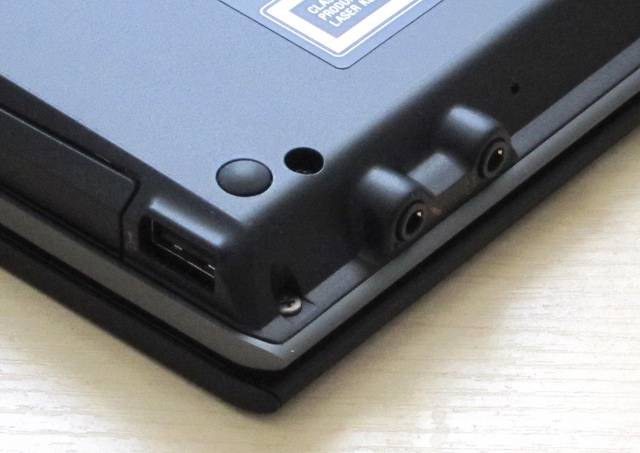
It's the little things though, and one of the key design issues for me with the Z11 in terms of betraying the 'designed - not really' approach is e.g. the headphone / mic jacks. Logical engineering, looks horrible, executed in a way that emphasises the cheap-lookingness of the plastic.
While the unibody advantages are marketing nonsense, Apple have however been on an inexorable path to further refining their design language. Even Dell has made major strides in their design language over the last three or so years. With Sony, I can't actually see any progression at all from a design language standpoint from the '04 VGN-S1 for example. The SZ seems like an anomaly in that respect, one which I liked better than the Z's - which remains something of a mess, and seriously detracts IMO from 'the warm glow of ownership'.
I think Sony maybe has to realise that not just for the reason above, since tech is now firmly in the mainstream, the majority of tech opinion holders these days are more emotional, possibly dumber, and more importantly much less objective creatures inhabiting the likes of engadget, and that your design has to incorporate something other than simply the needs of your engineers.Attached Files:
-
-
the only thing i dont like about new Z is:
1. front connector for speaker in and mic in.
2. rubbery feel at the bottom. the previous has solid carbon fibre feel.
3. non solid plastic palmrest
thing i like:
1. lid is sturdy and firm to hold.
2. backlight
3. spec (obvious reason lol)
overall, to summarize, theres always a pros and cons. lol
off topic: why our nick become red? i thought everyone were banned. lol -
What is 'carbon fibre feel', when there's not much in there in terms of carbon fibre?
-
The people who think the Z11xx feels "cheap" and "plastic" really confuse me. I don't get it? How do you expect something to get lighter? MAGIC? It's marketed as an ultra-portable desktop replacement computer, not a ruggedized computer. If you're looking for rugged, you won't find a match in the Sony line-up; that's not their design target, so of course they don't meet it - they're not trying to.
I simply love the design and agree with Miyabi about the dislikes and the fact that there will ALWAYS be aspects you don't like about EVERY laptop. I really wish it didn't have a plastic palmrest.
Take the HP Envy 13 as a comparison point ( http://www.shopping.hp.com/webapp/shopping/computer_can_series.do?storeName=computer_store&category=notebooks&a1=Category&v1=ENVY&series_name=ENVY13_series&jumpid=in_R329_prodexp/hhoslp/psg/notebooks/ENVY/ENVY13_series). It's all-metal exterior makes it more rugged than the Z. I've held it in my hands. But that ruggedness comes at a cost. There's no optical drive and it weighs 1/2 lb. more, has a slower processor, a 5400RPM HDD, only 2 USB ports and only 3GB of RAM in it's base config. And you also have HP's inferior displays, which only look good at a narrow range of angles.
My point here is the same as many others here on the forum: in the Ultra-portable category, the Z has struck an amazingly fast and lightweight balance. Was something sacrificed in ruggedness? Perhaps. But it's way more rugged than my Z690 is. -
Im guessing that it means it has a more sturdy feel to it than just cheap plastics, since currently im using an SZ the bottom chassis is all....well i dont know but its definitely regular plastic becuase the RAM cover is metal and the rest of the chassis is almost rock solid IMO and it feels like a extremly sturdy build from the palm rests, and everything. They should of kept up and implemented this on the ongoing models, if this was available on the previous Z and thats really good but for a, as Sony puts it, "Near PERFECT laptop" than it should feel like it, and with a price so high you expect EVERYTHING to be top of the line and extremely well-built, It doesnt make sense why Sony might be "trying to cut costs"(IMO) with using a cheaper feeling bottom chassis.
EDIT: lol i noticed the RED banners as well thinking that some people have moved onto a new level or a new level has been added as i saw another post with high rep members...but i see it for all common members now....different but nice
-
The SZ was a lot heavier correct? Wouldn't the SZ be more related to the very sturdy S then the less sturdy, but much lighter Z?
-
I don't think FrinkTL et al are getting it all.
Actually, the Z - certainly the'10 Z - feels (and is) exceptionally sturdy for what it is. That is not the basis of the issues I raised. -
SZ is between C2D Z (3.3 lb) and P-M S (4.2 lb). The SZ with carbon fiber thin lid is 3.7 lb, but the SZ with magnesium thicker lid is 4.1 lb. SZ is just too tall for me -- it looks like it could fit a 4:3 screen in there.
-
The SZ is over an inch deeper than the new Z... granted the screen is 16x10 instead of the thinner 16x9. There's a fair amount of "overhang" on the palmrest area that probably could have been cut out.
-
Literal internet is literal.
Perhaps I should limit myself to hanging out where people understand words like 'design language'. Oh wait, they're full of Appleists... darn. -
Well, you did say it feels cheap, which usually also means less sturdy...
I think I know what you mean, though, but I haven't actually seen the '10 Z in person yet, see if I can bump into one this weekend in Atlanta. I am actually quite happy with the bottom of the '08 Z, coming from '04 S that has solid magnesium bottom.
On the other hand, to me the biggest requirement for the bottom is that it is color matched with the lid -- silver lid and black bottom is an absolute nightmare for me (same goes to silver keyboard surface and palmrest with black keys), which both '10 Z and the old SZ offer. -
i mean its like a smooth solid surface.
-
From a Mac user's stand point it is well built as far as PC laptops go. But I find myself treating it gently compared to how I treat my Macbook Pro which is built like a tank (and weighs as much compared to the Z).
-
and by that said, i think Vogelbung has a wish that a new Z has a built like a MBP.
-
also the HD ratioed screen isn't much to my liking (i know the previous Z also has similar LCD dimensions) as the height has been reduced giving the impression of a much smaller screen.
-
I think he just wants the bottom to look more like metal or something more expensive...like a glossy carbon fiber finish...
Like I said, I think the '08 Z looks alright. Yes, you can tell it apart from a real magnesium bottom, but it doesn't look that much like regular plastic. I think if Sony somehow makes the bottom a little bit more glistering you would be really hard-press to tell it apart from a real metal without touching it.
Still not sure about the new Z, though, but to me the palmrest is enough to turn me off (that is, when I already have a '08 Z that still satisfies my needs), and that is a part that I would see anytime I use it. -
I think looks are subjective and that Sony can't make everyone happy. I like the palm rest, it bringsit up a little and breaks up the look a little. I think the headphone jacks look cool and the plastic doesn't look cheap.
Everyone has their own opinion and therefore, no manuafacture can build te perfect computer fo everyone, even if it is top of the line. -
That would be pretty much the last thing I'd want. All show, no go is a trademark of the useless unibody design. But it is very effective in convincing otherwise non-knowledgeable consumers that it is better built, because it adheres better to their layman expectations.
-
The problem isn't the looks, but the design, as in placement.
You can't use the laptop on your lap with headphones without the plug digging into you.
You can't use it at all with the extended battery and a converter plug (high quality headphones tend to come with 3.5" plugs), because of the tilt.
And even if using it with mini plug headphones, it still gets in the way of your thumbs or palms. -
I agree, this is more the function then the beauty issue. Although those jacks in front look ugly anyway if you ask me
-
I am starting to let the plastic palm rest issue go. But, what I still can't figure out is the exact color of the gray aluminum and palmrest. In some pics, it looks like the palmrest is darker than the aluminum and in others it looks the opposite. I think some of the photos are misleading due to flash, lighting. Wish I knew what it really looked like it. I plan on pulling the trigger when I know for sure.
-
The docking station port and docking situation in general with the new Z is my biggest gripe. Having experiences with the very nicely designed docks and docking mechanism of ThinkPads and Dell Latitudes, seeing the ridiculous design of the Z's docking mechanism and dock irks me to no end.
-
Finally saw the new Z in person. The bottom doesn't look more plastic to me, but the texture feels very different from the old Z -- almost feels like studded pistol grip kind of texture, but it's definitely a roughed plastic-feeling surface. Maybe Sony receive too many complaints that people have their Z slipped off their hand? I know I did a couple times, having a really dry hand.
I am not exactly sure why it looks cheap, though, other than the fact that it is plastered with vent grills of different shapes. Not sure how many of them are actually air vent and how many of them are for wireless antennas, but there are four of five of them while the old Z only has a grill on the memory cover that is very noticeable. I guess function trumps looks when you are really trying to squeeze everything in and cut all the weight... -
Well it's not new. But I suppose their ultraportables are less likely to get docked, so it's not really attracted a huge amount of complaint recently... only the Z has now entered ultraportable weights. Regardless of my design rants, I find it staggering that the Z, with everything it has, now tips the scales at pretty much the same weight as the Macbook Air - which is (apart from its design) a total joke next to the Z.
I still think there's a lot more than can be done in terms of balancing aesthetics along with engineering requirements, and as I said before, while Sony has consistently pushed the engineering envelope since the early Y2K's, I don't see anywhere near the same evolution in design. The little touches (or lack thereof) on the palmrest overhang for example are a prime example of solely leaving engineers to work on a product, as opposed to having some design input as well. The texture of the composite is also down to the same IMO. -
Yes this is really too bad, especially when the Z is such an awesome success. The Lenovo docking station is fantastic as it allows you to easily slide the laptop around until it clicks into the interface plus all the awesome ports, key locking, disconnect switch, and power on/off switch.
Insane as this sounds, I really hope that by June we'll have an improved docking station for the Z.. especially one that has a port for audio out for goodness sake! -
The problem is everything really from a design standpoint, as I remarked above.
Take a look at this for example:
![[IMG]](images/storyImages/tcBGq.jpg)
This is the bottom of the Dell M6500 Covet, an ISV-certified professional workstation. (the distortion is due to the crap camera btw)
Now take a look at the bottom of your Z.
Now tell me which looks like a complete mess.
It's not the relative weights, but the approach to design. -
I would also say relative weight would be important. Also, what flaws does that Dell contain. Without even using it. Without even reading a review, I can tell you it probably gets hot on the bottom. Why can I say that with confidence? Because I have used dozens of Dells (Latest D and current E) and they all have the same flaw of being hot. Also, I had a Dell E6400 and E4300 and both of felt cheap and badly engineered yet they cost many thousands (in Australia).
Dell uses a fancy metal bottom, which on paper should be swanky and nice, but they get extremely hot, because heat transfer through metal. I would guess that is the reason why the expensive Z doesn't use a metal material on the bottom, as well as to save weight. -
... And are you telling me your Z remains icy cool while it's under load? Relatively speaking the M6500 gets about as hot as the Z under a corresponding load. And I also didn't draw parallels to budget business notebooks - although in certain cases I suppose I could.
The discussion is about design, not the relative functional merits of laptops or materials science which most clearly have no beyond-Google experience of in any case. I'd say it's actually also as much a discussion about attention to detail beyond extreme shoehorning engineering - or the lack thereof - on the Sony. -
Well, I don't know, you can probably say the same thing about every single airplane since Wright Flyer, too. To this day they are still not "designed", but they still look prettier and prettier to me, especially after you look at their performance characteristics.
As much as I love more design into it, and I can kind of agree that Sony has not pushed as much in design since the end of violet VAIO days, I am not sure I am ready to give up the engineering marvel for the design. I would love to see Sony try one or two and see how market reacts to it, though, especially if it comes with the old violet.
BTW, the bottom of M6500 looks cleaner, I agree, but it also has the luxury of 17.3" footprint to arrange stuff. Besides, that thing just looks plain ugly when you are using it, not to mention the traditional ridiculous Dell keyboard. And whatever flavor my company uses, it's a dog for what we need to do.
EDIT:
One more thing about M6500, where are all the stickers? Those are the first thing that kill the look of the bottom of a PC laptop... -
I think that the plastic rest has been put on for better protection. The old Zs were aluminuim laqured (spelling!) and after a while the laquer wears. in some cases i know that the paint can bubble and chip - not sure if this is wear, or a reaction to heat / sweat! from the hands as they rest on the palm.
So i suppose a plastic palmrest was a solution. does anyone know if they changed the materiel on the keys - the old z keys go shiny after a while. -
The keys on the new Z are of a different material. It is more smooth however I find that it gets dirty easier.
-
I would love to see the proof of bottoms being the same temperature, both idle and under stress. It is not that I don't believe you, it is just that I don't believe you...
-
Well - they could have had the bottom just like the HP Elitebook or a previous M6300. It's when design enters the fray that they took a conscious decision to style the bottom as well, not just let the engineers have their say and that's it. And with the Z that's basically what's still happening. You have a styled top - and then the designers either lost interest, or the engineers took over.
It's not about materials and it's not the shaving weight: The reason I posted the M6500 as an example is that even with essentially the same materials as many other machines, the decision to style something instead of just letting the engineering decisions congeal into the product is what made the difference. You could have a considerably cleaner design with the Z even if you stuck to exactly the same materials.
RE: Stickers - they're under the battery compartment. There's one sticker - the service tag - in that white oval space I've shopped out. This is one other design decision (the rest of you - starting to get me now? It's about the details). The Sony bottom would already look a lot cleaner if they moved all the crap under the battery. -
OK, I'm sorry for saything this but...who LOOKS at the bottom of their laptop while they are using it? I mean....
REALLY
? Sure there are WAY too many stickers on laptops (top and bottom), but who really CARES what the bottom looks like? I only ever see it for a few seconds as I slide it into its slipcase. It's not like I'm looking to parade my Vaio around - bottom side first - to say, "Hey, I know the lid is gorgious, but check
out the
bottom!"
I know, I know, I'm not normal... -
ICY cool, no. Coolest I've used? Yes. Even while gaming only the left side of the keyboard gets warm (and not hot). Sure the vent is blowing air hot enough to melt butter, but that's what it's SUPPOSED to do (evacuate the heat out and away from the components...and me). Of course I'm using the high-end i5 and not the i7, which I'm sure runs a tad warmer.
I'm not sure I agree. Laptop design, unlike a desktop is all about compromise. You can't get everything. One design theme must "drive"/rule supreme and all other design considerations serve that one. In the case of the Z it is the "function @ a tiny form factor" that is the driver. Pretty? Sure, if they can squeeze that in, but you can't cram all the crap that's inside the Z into a netbook size/weight and expect it to be the everyone's dream in appearance too. That's just not fair. That's like receiving a million dollar inheritance and then complaining because the check it was written on doesn't use a color scheme that appeals to you.
-
You know, compared to the old violet VAIO, Sony definitely made the stickers bigger and probably more as well. The violet VAIO also makes the stupid Windows sticker less intrusive, since the color of the sticker blends in with the bottom. I would love to see some effort on that ground. In fact, just trying using black label with white font on the black bottom would be eons better than using white label with black font.
On the other hand, it's just hard to know what additional constraints on engineering side would those bottom design like M6500 or other would bring on a laptop footprint like the Z. I agree that Sony could use that kind of design and I wouldn't mind seeing Sony try, but I would just have to wait to see such Sony design in action to know if there is any engineering trade-off that I don't like. -
That's not exactly what Vogelbung was saying though.
Sony has been putting out this kind of super powerful small laptops since the first VAIO laptop in 1997. What he was saying is that compared to those good old days, where Sony aimed for the same "function @ a tiny for factor" as today but was able to deliver not only that but also what he (and many others that have used the old VAIO) considered to be a good visual design, the newer VAIO seems to be biased toward the functional excellence and not as strong on visual design (at least on the bottom).
Without actually getting into all the design trade-off discussions within Sony's development team, it's hard to know whether such a solution exists that delivers both the functional excellence (as we have witnessed in the new Z and like) and visual design perfection. I would agree with Vogelbung's observation and I wouldn't mind seeing Sony tries to top itself and get the next Z to deliver both, but I think most people here that are considering or have already purchased the new Z seem to be quite happy with the functional excellence by itself -- and maybe that's why Sony doesn't pay a whole lot of attention on visual design any more, because it's not like there is a competition that actually matches Z's functional excellence and Sony needs the visual design as a differentiation in the market. -
It's still not getting through to some, is it. It's not how the bottom looks as such. It's that they actually styled it in the case of the Dell, as well as moved the stickers out of sight - i.e. attention to detail in design.
In product design, attention to details is pretty much everything for a successful product. Which is why Apple - despite their distinctly mediocre engineering capability in comparison to Sony or HP, with Dell fast catching up - remains the most lauded make out there. Their reliability may be crap, their materials selection may be iffy - but the attention to detail of their designs is what makes people take notice. It's not about how things look as such. It's about the attention to detail in design, which if successfully executed becomes part of the look.
The Z's top is a competent, but rather lacklustre effort in design. But as soon as you move out of the areas that you may not look at every day, the details completely fall apart. This is part of what I mean by attention to detail.
Do I have to keep on highlighting design? -
Apart from the resolution, the Acer TimelineX models are shaping up to be VAIO Z killers as far as the functional excellence is concerned, so perhaps Sony really should have worked harder on the visual design after all.
Nonetheless, from the photos I've seen the Z looks a lot better than the TimelineX models.
Also, Vogel, you should really say "visual design" rather than just design, because the term in general also implies the technical aspects.
What do you guys think of the Z11 redesign?
Discussion in 'VAIO / Sony' started by Vogelbung, Mar 31, 2010.


![[IMG]](images/storyImages/homer-car.gif)
